What prints with the starting settings
| Paper | US Letter — 215.9 × 279.4 mm (8.5 × 11 in) |
|---|---|
| Hand | Italic, slant 83° from the baseline |
| x-height | 5 nib widths = 19 mm |
| Margins | 1/2″ |
| Line weight | 0.15 mm (bold 0.35 mm) |
| Print setting | Scale 100% / Actual size |
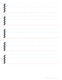
Guide lines that match your pen
Good calligraphy is mostly consistency: the same x-height, the same slant and the same spacing in every letter. Guide sheets give you that structure. Slip one under a sheet of layout paper, or write directly on the print, and practise until the rhythm is in your hand.
The hands
Italic. A quick, slightly slanted hand at about 5 nib widths, with a gentle slant of about 5 to 10° from upright.
Foundational. Edward Johnston’s round, upright hand at 4 nib widths, a common first hand.
Blackletter (Textura). Dense, upright, angular letters at about 5 nib widths.
Uncial. Rounded capitals-only letters at about 3 to 4 nib widths.
Copperplate and Spencerian. Pointed-pen scripts with strong slants and generous ascenders and descenders.
How to practise
- Measure your nib and enter its width.
- Rule a ladder with your own pen to check the x-height matches.
- Practise basic strokes before letters.
- Write one letter across a whole line, then pairs, then words.
Printing tips
Print at 100% / Actual size so the nib widths match your pen. Use smooth paper such as layout paper over the guide sheet for ink work.
Popular calligraphy guide sheet sheets
Frequently asked questions
Why are broad-edge guides measured in nib widths?
Broad-edge letters get their proportions from the pen. The x-height of each hand is a number of nib widths, so the guides change with the pen you use. For example, Italic is usually written at 5 nib widths and Foundational at 4.
What is the nib ladder?
The small black squares stacked at the start of each line, each one nib width tall, which is how calligraphers check the x-height. Making your own with the pen held at 90° is a good test of a new nib.
Which nib width should I enter?
The width of your nib's edge in millimetres. Common sizes are 1.5, 2, 2.5, 3 and 3.8 mm; manufacturers usually print the width on the nib or the packet.
How do the Copperplate and Spencerian guides work?
These pointed-pen scripts use the value you enter as the x-height and draw ascender and descender spaces twice as tall (2:1:2), with slant lines at 55° for Copperplate and 52° for Spencerian.
Which hands are included?
Italic, Foundational, Blackletter (Textura), Uncial, Copperplate and Spencerian.
Can I turn off the slant lines?
Yes. Upright hands have none; for slanted hands, Slant lines can be switched off once you are confident.
Last updated · About us