Variations
What prints with the starting settings
| Paper | US Letter — 215.9 × 279.4 mm (8.5 × 11 in) |
|---|---|
| Hand | Blackletter (Textura), upright |
| x-height | 5 nib widths = 19 mm |
| Margins | 1/2″ |
| Line weight | 0.15 mm (bold 0.35 mm) |
| Print setting | Scale 100% / Actual size |
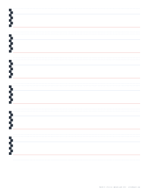
The Gothic hand
Textura, the most formal Gothic or blackletter script, is built from tightly packed vertical strokes with angular feet and heads. Its name comes from the woven texture of a page written in it. The script rewards regularity above everything, so accurate guide lines matter more than in almost any other hand.
Using the nib ladder
Each writing line starts with a small ladder of alternating squares, each one a nib width high, stacked up to the x-height and ascender line. Before you start, make a few nib-width marks yourself at your pen angle to check they fit the ladder. If they don’t, adjust the nib width in the generator until they do.
Practice routine
- Minims: rows of short vertical strokes with diamond feet, spaced one stroke width apart.
- The letter i and n: minims joined by thin hairlines at the top.
- o, c, e: the “round” letters of Textura are made of straight strokes and angles.
- Words: keep the white space between strokes equal to the stroke width.
Related hands
Uncial and Foundational are rounder broad-edge hands that are often learned first. The calligraphy guide sheets guide explains nib widths and ratios for each style.
Printing
Print at 100% / Actual size so the line heights match your nib. Smooth, bright paper of 90 gsm or more keeps the ink from feathering, or print a guide and use it under layout paper.
More calligraphy guides sheets
Frequently asked questions
What x-height does Textura use?
About five nib widths, which these sheets use, with two nib widths for ascenders and two for descenders. With a 3.8 mm nib, the x-height is 19 mm.
What pen angle should I hold?
Around 40 to 45 degrees to the baseline for Textura. The steep angle gives the characteristic diamond-shaped feet and heads on the vertical strokes.
Why are there no slant lines?
Textura is an upright hand: every vertical stroke stands at 90 degrees. Keep your downstrokes parallel to the page edge instead.
How do I match the sheet to my pen?
Measure your nib width (or read it from the pen, for example 3.8 mm on a Pilot Parallel) and enter it in the generator. The nib ladder on each line shows the steps.
Last updated · About us