Variations
What prints with the starting settings
| Paper | US Letter — 215.9 × 279.4 mm (8.5 × 11 in) |
|---|---|
| Hand | Foundational, upright |
| x-height | 4 nib widths = 15.2 mm |
| Margins | 1/2″ |
| Line weight | 0.15 mm (bold 0.35 mm) |
| Print setting | Scale 100% / Actual size |
The beginner’s hand
Most calligraphy courses begin with the Foundational hand because it is simple and logical. The o is nearly a circle, arches spring from the stems in a round curve, and every letter sits upright. Learn it well and every later hand, from Italic to Blackletter, is easier.
The guides on the page
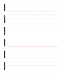
Each line has a baseline, an x-height line four nib widths above it, and lighter ascender and descender lines three nib widths further out. A nib ladder at the start of each line shows the steps. If your pen is a different width, enter it in the generator and the whole sheet rescales.
Practice order
- o and c: two overlapping curves at a 30° pen angle.
- n, m, h, r: stems with round arches.
- a, d, g, q, b, p: the bowl letters.
- v, w, x, y, z, k: the diagonals.
- Words and short sentences, watching the spaces inside and between letters.
Next hands
When the round forms feel steady, try Uncial for a medieval look, Blackletter for a Gothic one, or Italic on the calligraphy paper page. The guide sheets guide covers nib sizes.
Printing
Print at 100% / Actual size. Use bright, smooth paper, or slip the guide under thin layout paper so you can reuse it.
More calligraphy guides sheets
Frequently asked questions
What is the Foundational hand?
A round, upright broad-edge script developed in the early twentieth century from a tenth-century English manuscript. It is widely taught as a first calligraphy hand.
What proportions do these sheets use?
An x-height of four nib widths, with three nib widths each for ascenders and descenders. With a 3.8 mm nib the x-height is 15.2 mm.
What pen angle should I use?
A constant 30 degrees to the baseline for most strokes. Keeping the angle steady is what gives the letters their even thicks and thins.
Why start with Foundational?
Its letters are based on the circle and simple straight strokes, so it teaches pen angle, spacing and rhythm without the complications of slant or compression.
Last updated · About us